Tuesday, April 28, 2009

19 Girls and Me (x 4)


To see all my illustration portfolio samples, visit stevensalerno.com
A few years ago I illustrated a picture book project for publisher Penguin... actually for their children's book imprint Philomel Books, entitled “19 Girls and Me” written by Darcy Pattison (released in 2006).
The story is about a young boy (John Hercules Po), his 19 female kindergarten classmates... and how they all become friends through their imaginative recess adventures around the world to places like Mt. Everest, The Great Wall of China and the Amazon River.
In these past few years this wonderful book has also been translated into German, Chinese and Arabic (the various cover images are posted above) allowing children from these other countries to share in Po's adventures, too. The Chinese edition even has the entire story repeated in English (with all the illustrations scaled down) in the back of the book, also including a musical CD. (I listened to the CD, and it appears to be Chinese children singing the story as if it were a Broadway musical -so charming!)
The Arabic edition, of course, reads from back to front... so all the images were flopped. (I never allow my images to be flopped, because visually they never seem quite the same... but in this case, it was a cultural necessity for this version.)
In “19 Girls and Me” all the illustrations depicting the children in the classroom, or when they are first stepping out into the schoolyard, are in black&white, except for the girls red dresses and Po's blue blazer. Then in all the scenes where the children are on their fantasy recess adventures everything is rendered in full color.... sort of like the same visual tactic used in the movie The Wizard of Oz ... a film in black&white, which then becomes full color when the main character Dorothy literally falls into the Land of Oz.
The interesting "behind the scenes" story regarding the illustrations for this picture book, is that I actually created all of the final images in full color. But when I showed the final illustrations to my Philomel Books editor Michael Green and art director Cecilia Yung they correctly assessed that the classroom and playground scenes, in terms of color, were too hot and bright to the point of distraction... so I came up with the solution to convert those specific images into black&white (ah, the magic of Photoshop!) but made them more stimulating by keeping the girls dresses red and Po's blazer blue. The end result looks as if it was my original intention to have the various “school” scenes in black&white and only the “fantasy” scenes rendered in full color.

Sunday, April 12, 2009

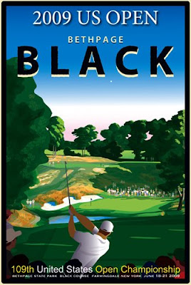
My 2009 US Open Posters, Bethpage BLACK Course


Visit my golf art web site, sasgolf.com to purchase signed, limited edition prints. 

When not busy with my illustration career work load (creating graphic images for magazines, advertising campaigns, newspapers, product packaging, books, children's books, etc...) which is usually all of the time, I also find the time to create personal works just for myself... many are images on the game of golf. 

As you can see by my golf prints shown here (©2009 Steven Anthony Salerno), these images are not created in the same whimsical style seen in my usual commercial illustration work that art directors recognize and depend on... (to see all my illustration portfolio samples, visit stevensalerno.com) ... but rather in a more realistic, graphic poster style: 

I start with many b&w pencil sketches on paper, then edit them down to one final composition, followed by executing a tighter, final sketch. During these sketch stages I simultaneously develop the poster's type design as well, integrating it in tandem with the image composition. Next I redraw the image on my digital Wacom drawing tablet using Adobe Illustrator software, building the image slowly in layers, and making all the color decisions as I go along, and determining the type font and placement. 

With my regularly commissioned illustration assignments, I am always working as quickly as possible because of the short deadlines. (and also because I normally have several assignments going on at once!) However, with these golf images, since I am creating them just for myself without a deadline, I take my time and do not complete the poster image until I am entirely satisfied with it. 

In June of this year, the 109th playing of the United States Golf Association Open Championship will be conducted at the notoriously difficult Bethpage Black Course in Farmingdale, New York. (The US Open was last played there back in 2002, which Tiger Woods won.) 

The official 2009 US Open poster the USGA had already commissioned for the upcoming event in June, I felt, missed the mark in terms of reflecting the bold character and psychology of the Black Course at Bethpage. Their official poster is well executed, but fits into a "charming" visual category, sort of like a nostalgic, quaint, Currier & Ives print... In my opinion, despite the fact that the course was designed back in the '30's, there is nothing remotely quaint about the psychology of the Black Course. It is a brute of a golf course that makes even the best of players in the world crumble, and thus deserves a matching bold poster! 

So, just for the fun of it, back in January, I decided to make my own poster for the tournament, and I ended up creating seven different posters (only five of the seven are shown here). I also feel that the majority of “Tiger Woods/Anthony Kim generation” fans, who will be looking to purchase a memento of the event from the merchandising tent during the week of the US Open at Bethpage, will more likely prefer to buy a contemporary poster which reflects the imposing boldness of the Black Course, and not a quiet, quaint poster image. 

The top poster: depicts a competitor hitting his tee shot at the downhill par three eighth hole with the gallery watching. (beneath is a detail view of player) 

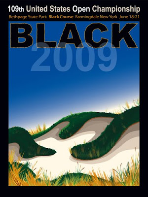
The 2nd poster: depicts a ground-level view of a typical A.W. Tillinghast bunkering complex at the Black Course, which the players will try to avoid during the US Open. Tillinghast is the famed golf architect who designed the course in the 1930's. (beneath is a detail view of bunker) 

The 3rd poster: is a bold, stylized image of a golf ball, with the course seen low in the background, and in front is the famous "warning sign" declaring how difficult the Black Course is to play, which really does exist on the first tee there. (beneath is detail view of course in the background) 

The 4th poster: is a wide format panorama poster showing the second shot at the part five, fourth hole. This is my favorite image. It is bold, elegant and the type design is "in your face" just like the real course is. In the small screen shot posted here, one cannot see the quality of this image. (beneath is detail view of player) 

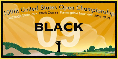
The 5th poster: is a theatrical, label-like symmetrical view of a silhouetted player hitting a shot to a distant green. (beneath is detail view of player silhouette) 

The real impact of all these poster images cannot be fully appreciated unless one sees them in their full 17" x 22" and 24"x 36" size. Seeing them in these small screen samples just does not do them justice. 

The 6th poster is one I recently created for the 64th Women's USGA Open Championship, which is being held at the Saucon Valley (Old Course) in Bethlehem, Pennsylvania in July 2009. 

After completing these posters, on a whim, in February 2009 I contacted and presented a few of the US Open/Bethpage posters to the Executive Director of the USGA, David B. Fay, as well as to the USGA Director of Licensing, Mary Lopuszynski. I briefly expressed that one of my posters could be added to their list of merchandising items for the Bethpage US Open event as an "unofficial" poster... to give the golf fans a choice in poster selection at the merchandising tent. (Personally, I feel my poster would out sell any other poster) Mary Lopuszynski did reply, stating that the USGA had already selected and produced all their merchandising items for the 2009 US Open event. In other words, I was too late. Oh well. No harm done... and it was a nice way to introduce myself to the USGA. 

Subsequently I contacted Tim Carr, the current art director of LINKS magazine. Tim and I met when he was the art director at GOLF magazine and we played a round together at the Split Rock golf course in New York. I showed him a few of these 2009 US Open/Bethpage posters I created, and since his magazine will be creating a feature article about the upcoming 2009 US Open at Bethpage, he is contemplating commissioning one or more of my poster images for that magazine issue. (He would use versions of the image(s) without the text) 

So, now I am already working on my 2010 version of the US Open poster (being held at the Pebble Beach golf links on the Monterey Peninsula, in California) just for the fun of it, of course, but maybe it will also find it's way over to the USGA! 

(You can see a previous posting of some other personal golf art images by clicking here.)


Saturday, April 11, 2009

"Going Out of Print"... for a book, this is like forced retirement

To see all my illustration portfolio samples, visit stevensalerno.com
Unfortunately, two of my children's picture books, as both author & illustrator, will be going out of print soon with publisher Marshall Cavendish. It's very sad, as both these picture books are very solid stories with, I must say, excellent illustration... but of course, as the creator of the words and images, I am bias! (posted above are the covers)
Hopefully another publisher will want to pick up Coco the Carrot. It's a fanciful story about a carrot who discovers she has talent for designing and making hats, takes an ocean cruise adventure, tumbles overboard, becomes friends with a monkey named Anton on a tropical island, is rescued, ends up in Paris, and becomes a famous hat designer. I won't tell you how it ends... you'll just have to buy one and read it yourself. I think someday, this imaginative story with the spunky main character will be in print again, or maybe even made into a musical play!
Girls really love this story. When I did a book signing a couple years ago at Books of Wonder in New York City (the best children's book store in the city or maybe anywhere) they were having me sign the book and their sneakers, too!
You can still get a copy from Barnes & Noble or Amazon, but not for long.
Little Tumbo is a tale about a little elephant who cannot yet trumpet loudly... he is still leaning. His curiosity gets him kidnapped, and his captors plan on selling him to the circus.... but an old boatsman and his grandson help Tumbo escape...and alone he makes the long journey back toward home. But the kidnappers track him down and just as Tumbo sees his whole family in the distance.... they nab him again! You can guess what happens next! Let's just say Tumbo finally is able to trumpet loudly at a very crucial moment!
You can see inside illustrations from these books on my web site in the Children's Book portfolio section, as well some sketches, too.
Onward and upward!

Saturday, April 4, 2009

PANTALOON -remake of the 1951 Little Golden Book classic

To see all my illustration portfolio samples, visit stevensalerno.com
In 1951, publisher Simon & Schuster's imprint for children, Little Golden Books, released another picture book in their long line of hundreds of little slim storybook gems entitled, PANTALOON, written by Kathryn Jackson and illustrated by Leonard Weisgard.
I think every kid in America, and millions of children in countries throughout the world as well, have owned or read one of these many Golden Books titles. Pokey Little Puppy, Taxi That Hurried, Tootle, and Saggy Baggy Elephant come to mind.
At the end of 2007 I was contacted by Roberta Ludlow, the children's book art director at Random House (Random now owns the rights to all those hundreds of Little Golden Book titles from the '40's, '50's, '60's, etc...) and was asked to illustrate their re-release of PANTALOON. (slated for release later in 2009 or possibly early 2010) This new version of PANTALOON will be a full-sized, hard cover edition. Random editor Diane Muldrow later informed me that their original intention was simply to re-release PANTALOON with the original Leonard Weisgard illustrations, but that Weisgard's estate could not locate the original art for digital scanning. So Random made the decision to have a contemporary illustrator give a new visual spin to the 1951 classic... me!
I was thrilled to have been chosen for the task to illustrate this tale about the baker and the over zealous poodle, Pantaloon. Who could pass up creating images about a baker, tons of pastries, and a dog who rides a bike? I also wanted to be a part of the Golden Books history!
In my earlier blog posts, you can view sketches and some additional spreads from this new book project. I also have images from the book on view on my own web site, in the children's book section.
I created all the images using brush and gouache, painted onto Arches 260 lb hot press watercolor paper, then scanned the paintings into Photoshop where I digitally enhanced some colors and moved some elements within the image to make it better fit the layout relative to the placement of text.
The text in PANTALOON is of course the same as it was in 1951... but my spin on it was to really bring out the nutty, frenetic character of the poodle Pantaloon, far more than in the original book. I did so by giving him a quirkier style bicycle, more animation to his movement (I love the original illustrations but they have a more static quality) and in one scene I combined his actions of playing the guitar, trying on hats, and taking a bath (which were all separate scenes in the original book) to purposely expose Pantaloon's goofy nature.
Posted at the top is my new cover art version and below it is the original cover art from the 1951 edition. Below the covers are spread illustrations I created for the new version of the book, with the corresponding illustrations from the 1951 edition just underneath.
I cannot wait to see the preliminary printing of the book!

Friday, April 3, 2009

Teens need an etiquette guide??

To see all my illustration portfolio samples, visit stevensalerno.com
Good manners have always been in fashion and always will be. Of course, that doesn't mean quite few a children, teens and adults, are not in immediate need of a little guidance on the subject of manners from time to time.
I remember a rather jolting scene one hot summer a few years ago here in NYC when I was in line at a drug store behind a big, hairy man wearing a tank top. He placed a few items down on the counter to purchase, one of which was a deodorant. The young woman behind the counter took his money and then as she began bagging the items the man nonchalantly popped off the cap of the deodorant and applied it under both his furry-mammoth underarms right there at the counter, then strolled out the store! The young clerk and I both looked at each in shock, probably to confirm someone else had also witnessed this gross violation of public manners! It is quite easy to see how children of such a man might not be learning the essential basics of proper social decorum, and would be in dire need of a manners guide.
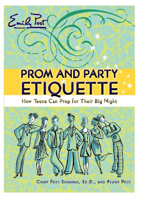
Which brings me to a book project I completed recently. I had the good fun to illustrate the upcoming Emily Post book "Prom and Party Etiquette" How Teens Can Prep for Their Big Night ...written by Cindy Post Senning and Peggy Post. The project consisted of me creating a color cover image, and about 45 one-color line illustrations for the inside of the book, all on the subject of guiding teens in the proper way to conduct oneself for all sorts of social gatherings, both informal and formal, leading up the pinnacle of teenage social events, the Prom. I am not sure when the publisher, Harper Collins, will be releasing the book... probably this fall.
The initial art director on the book was Matthew Adamec, then the responsibility was passed over to Jeanne Hogle, all under the watchful eye of Martha Rago, the Creative Director on the project. I created all the images in Adobe Illustrator, drawing directly with a pen tool on my Wacom tablet. In fact I did not even do sketches for the project. 45 inside illustrations were required, so I just by-passed the sketch stage and directly drew about 70 final images based on the chapter text, of which the editors then selected their required final 45 images. Of course, some of the 45 images needed re-working... mostly modifications to the character's hairstyles and clothes. The reason why I by-passed the sketch stage was because the inside illustrations were all simple line art, and depicting simple scenarios, and so it was just faster and more efficient for me to draw the final images from my mind directly to the screen.
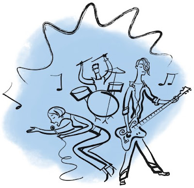
Posted here is one of the designer's early cover layouts, next is the final cover illustration depicting a row of teen friends as if they were posing for an informal photo. There are two versions of this: a limited color version, and a full color version. (I think the full color version is being used on the final cover design.) Next are a handful of the inside illustrations. In the book these images will be printed in just black & white... but posting them here in the blog, I added a splash of background color.
If you have a teen approaching their prom years, this guide really is a fun, practical gift book that they will use.