skip to main |
skip to sidebar


 See all my portfolio samples at stevensalerno.com
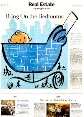
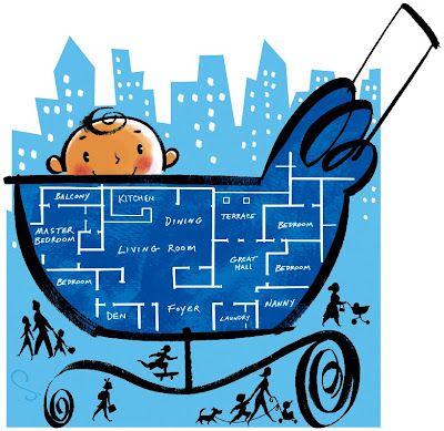
I created a large 1/2 page illustration for the cover page of the New York Times Sunday Real Estate section (6/27/10 issue date) ... depicting a baby in a buggy, and along the side of the buggy is a blueprint floor plan of a large 4 bedroom apartment.
(see top image of the printed newspaper page. Below that is the final illustration art as submitted to the art director.... and the bottom image is a shot of the piece in progress on my drawing table. The line drawing of the baby and the buggy and the little characters at the bottom were done with brush and black gouache on watercolor paper. The interior blue color of the buggy was also gouache and painted separately, then layered in with Photoshop. The background light blue building shapes were also created in Photoshop, as well and the white lines of the apartment diagram on the side of the buggy.)
The article comments on the fact that in recent years there's been a surge of 3 to 7 bedroom apartments making their way into the domain marketplace, to keep up with the growing demand for large apartments from the people with children and who no longer want to relocate to the suburbs once their family size calls for more space. I gave the baby a pleased countenance, no doubt from having a very big apartment to romp around in... Maybe I should have also placed a silver spoon in the baby's mouth, as 3 to 7 bedroom apartments range from $2.5 million to $7 million (and up!) Can you say, "Holy Foyer, Batman!?"
I had worked with the Real Estate section art director, Carol Dietz, years ago, but in a different section of the newspaper... I am so glad she called me for this fun assignment. I had not worked for the NYTimes in quite awhile, so it's "good to be back"...
I first began creating drawings for The New York Times back in 1980 (yes, before fax machines, before personal computers, before e-mail...) back in the days when the art director paraphrased the assignment's article to you over the phone so you could get started on the sketch stage. Then you actually went to their office at the (old) Times Building in Times Square on West 45th Street, was screened through security, and first showed your sketch to the art director who then disappeared for a while to show the sketch to the editors... Then the same process was repeated again when you came back a day or two later delivering the completed final art, and handing it over so they could make a photostat of it and paste a B&W print of the art onto the layout mechanical... yes, with glue! When I look back on it, I now realize why I could eat countless cheeseburgers and pizza and never gain an ounce over 135 lbs.... because I was running all over the city delivering sketches and final art every day of the week!
In 1980 I was a skinny kid just out of art school one year, a graduate of Parsons School of Design in NYC, where I had studied under J.C. Suares. J.C. (who had previously been the NYTimes Op Ed page art director and was currently the AD at New York Magazine) gave me my first illustration assignments at New York Magazine the week after I graduated from design school. He then also introduced me to Jerelle Kraus who was the reigning AD of the Op Ed page. She liked my work and I somehow managed to regularly contribute drawings to the Op Ed page and Letters to the Editor page from 1980 through about 1985. A couple years ago in 2008, Jerelle released her book, "All the Art That's Fit to Print, And Some That Wasn't" recounting her many years as the Op Ed page art director, including all the run-ins with the editors, as well as showcasing many of the artists who contributed to the page... including the likes of Andy Warhol, Larry Rivers, Brad Holland, etc... and me! (see my previous post on Jerelle's book)
During those early years and in subsequent years I created drawings for the Op Ed page, but also created illustrations appearing in many of the NY Times other sections, too. The Book Review, Business page, Sunday Magazine, etc... but by the end of the 1990's I was only doing maybe one illustration a year for the NYTimes. From about 2000 through 2007 my major newspaper client was The Wall Street Journal, as I was the regular illustrator for their Finicky Traveler column.
For the past few years I have been busy with my usual projects in advertising, children's books, magazines, packaging, and some animation character imaging for the web, etc... but have not really had a consistent gig with a major newspaper... so this recent New York Times Sunday Real Estate project hopefully will begin a renewed contact with the newspaper again! I am looking forward to the possibility.
 See all my portfolio samples at stevensalerno.com
Posted above is one of the illustrated scenes from my latest children's book, PANTALOON, just released by Random publishing house in April of this year. (see earlier posts about this picture book by clicking here and here)
This is the full view of the actual gouache painting (Winsor & Newton designer gouache on Arches 260 lb hot press paper)... in the final printed book the image is cropped slightly as the image bleeds off the page spread on all sides. Pantaloon, the main character of the story, is an obsessed, antsy, quirky, poodle bent on becoming a baker's assistant just so he can get close to all the pastries and sweets he adores. In this scene he's in the tub, wearing all his favorite hats, lamenting on his failed attempts at becoming the baker's new assistant. Pantaloon is a Kathryn Jackson story, and first published in 1951 as a Simon & Schuster Little Golden Book classic, with wonderful illustrations by Leonard Weisgard.
The remake of the 2010 book called for all new illustrations, and I had the terrific honor of being able to give my stylistic visual spin on the story ... Look for it in the bookstores!


 See all my portfolio samples at stevensalerno.com
A while ago (last year?) I worked on a fun annual report project with BCN Communications in Chicago, with art director Rob Mileham. It was a preliminary test stage for their client Pepsico's Annual Report. The agency was exploring different options for the visual images to be used... and I was chosen for the illustrative approach.
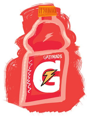
My task was creating still life graphics of some of the well known consumer products under the Pepsico umbrella of companies. The art images were taking the tact of a "hand-drawn" look with a bit of a purposeful naive feel to them (compared to the usual photographic approach). I created still life vignettes of Quaker Oats Oatmeal, Gatorade, Tropicana Orange Juice, Lays Potato Chips, and Pepsi Zero. Each image was created in Adobe Illustrator. The essence was to capture the recognizable container shape and product colors with a bit of flair...
I had fun with these images...I always do when drawing food images, but it's too bad that my illustration approach was ultimately not selected for the final stage use for the client's annual report. This happens many times in advertising... wherein the agency will present the client a photographic approach, and a couple different illustrative approaches before deciding on the final "look" to go with. Sure, you get paid for the preliminary stage work, but it's an empty exercise, because the satisfaction is having the work seen in print, which also brings new assignments your way. Hey, you can't win them all!
My favorite one?... the Gatorade bottle!


See full portfolio of illustration samples on my web site at stevensalerno.com
I recently completed a project with Larry Fredette, Creative Director of Fredette & Associates in Pittsburgh on the advertising and other print promotions for a new commercial real estate development project named BAKERY SQUARE, near the corner of Fifth and Penn Avenues, transforming the former Nabisco factory into a mixed-use center that is quickly filling up with retailers and big-name corporations and institutions. The developer is Walnut Capital of Pittsburgh.
Posted here is the magazine print ad I recently completed employing the character of a baker as the visual anchor and tie-in with the site name. The baker is mixing the four catchy theme words of the ad copy, WORK, SHOP, PLAY, STAY.
I also created a long horizontal graphic which was installed as a temporary "barrier art mural" at the site location... in fact this image was enlarged to a size of approximately 150 feet long by 20 feet high, the equivalent of about 2 stories high and nearly a city block long! See the architectural drawing depicting the side view of the massive renovated Nabisco factory and how my long outdoor graphic is positioned along the street level. The other images posted are details of this giant graphic image which has four themed panels engaging the four theme words: work, shop, play, stay.
I created the magazine ad image in Photoshop, but the long horizontal image was created in Adobe Illustrator (vector based imaging) at a proportional 20" tall x 150" wide, - which enabled it to then be scaled up by the design team to its final giant size without any loss of crisp edges and detail. At the bottom are the lamp post banners which were created pulling elements from the barrier mural art, and re-formatting them to fit the vertical composition.
If you are in Pittsburgh, visit the site and send me some pix!
