 |
a scene from Brothers At Bat illustrated by Steven Salerno |
publisher: Houghton Mifflin Harcourt (Clarion Books)
editor: Jennifer Greene
designer: Sharismar Rodriguez
author: Audrey Vernick
illustrator: Steven Salernorelease date: spring 2012
A well known children's joke riddle goes like this:
Q: "What has 18 legs and catches flies?"
A: a baseball team!
Well, in the case of my latest illustrated children's picture book, entitled "Brothers At Bat" (slated for a publication release date of spring 2012 by Houghton Mifflin Harcourt/Clarion Books) there is an added twist to that riddle:
Q: "What has 18 legs, catches flies, and is from New Jersey?"
A: The all-brother baseball team named ACERRAS.
The ACERRAS was a real life all-brother baseball team from New Jersey that played semi-pro ball in the late 1930's, '40's, and into the early 1950's... and were subsequently honored by the Baseball Hall of Fame in Cooperstown with a special ceremony in 1996 -for being the longest playing all-brother team in baseball history! In fact, the Acerra family had sixteen children in total: 12 boys and 4 girls. Wow! All twelve boys played on the ACERRAS semi-pro baseball team, which was coached and managed by their father, "Pop." They also had a dog named, what else? "Pitch." The story covers a span of about 70 years, from when the brothers were very young playing backyard ball, through their semi-pro baseball team days, going off to war, returning home safely, back to playing baseball again, starting their own families... and up to their ceremony at the Baseball Hall of Fame in 1996. The book is indeed about baseball, but at the same time it is also an intimate and heartfelt slice of American history experienced through the lives of one (very large!) family.
 |
| glove illustration from title page |
This true story is wonderfully written by author Audrey Vernick , based on her extensive research and interviews with the extended Acerra family members, including several of the surviving brothers who played on the baseball team. I took on the project of illustrating this story not only based on the exceptional quality of the writing, but also because it was my first time illustrating a non-fiction children's picture book which involved depicting real people and real events in history. I also wanted to be involved with this book because my own father and his brothers (my uncles) had somewhat similar life experiences as did the Acerra brothers: My father and uncles as young men all played high school baseball, had their lives disrupted by service in WWII and the Korean War, and a couple of them went on to play professional minor league baseball...one for the Brooklyn Dodgers. It just seemed a very comfortable fit for me to create the art for this unique story about the Acerras, because doing so, in a way, would also be a tribute to a part of my own family's history. In fact, I dedicated the book to my father, and in the back of the book (on the author's and illustrator's comment page) I described the baseball playing history of my uncles.
 |
| detail from half-title page (team bus) |
Jennifer Greene, the editor at Houghton Mifflin Harcourt, sought me out to work on this picture book, and I am so glad she did. Up until doing the art for Brothers At Bat, the artwork for all my other previous picture books to date have been executed in a very whimsically stylized manner... so how Jennifer determined that I should be the illustrator to illustrate this book is still a mystery to me. She had no inkling from any of my previous picture books as to how I was going to handle creating the images for this true life story, which certainly called for more "realistic" based imagery in order to capture the feeling of period scenes from the 1930's, '40's and '50's. Anyway, however Jennifer came to the determination of wanting me to illustrate this book, she surely chose the right illustrator. I think it was fate to illustrate Audrey's story! The strength of the writing and illustrations in this book have combined for a very strong picture book indeed. Most baseball books are clearly intended for boys, but Brothers At Bat is for everyone in the family to enjoy. This assessment has already been reflected in pre-publication sales: I think to date, Brothers At Bat has sold about 40,000 copies and the book won't even be released until spring 2012! (Coinciding with the opening of the baseball season, of course!)
Posted below are some of my sketches from Brothers At Bat, including photos depicting stages of drawings in progress...
 |
| 1 initial rough sketch stage of a double-page spread scene |
 |
| 2 more advanced refined sketch stage also showing general text placement |
 |
| 3 approved final sketch stage also showing precise text placement |
 |
| 4 completed final artwork of the double page spread |
The sketches sequence above shows a preliminary rough sketch of a spread scene, through to the completed final art. Not only must I choose exactly which actions within the text to illustrate, and how to physically depict the imagery, but the illustrator must also decided how the text will fall based on the images (page turns), and must also pre-plan allowing logical sufficient areas within (or around) the art for which the designer then creates the final layout of the type. I generally do all my preliminary sketches in black & white and then work out the color during execution of the final art...though, all during the sketch stage I am already formulating plans as to what the color palette will be in the final images.
 |
| preliminary rough sketch stage showing all the brothers as boys |
 |
| pasting lines of text onto sketch, experimenting where text associates with art |
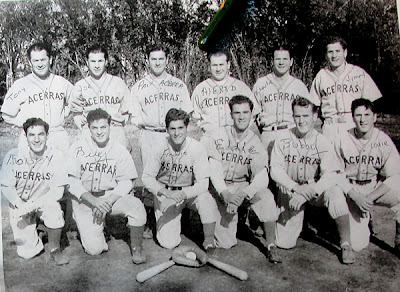 |
| photo of the entire ACERRAS team (about 1950) |
The above straight-on team photo above (provided by the Acerra family) was basically the only working reference photo I had to use for the entire project. (I also had one photo of the father standing with two of the brothers, and a photo of the family house in New Jersey.) Therefore, to create the many different scenes required in the book essentially I had to speculate what the boys looked like from different angles, what they looked like at different ages, etc... This lack of sufficient photo reference meant that for most of the scenes, what I was really doing was basically creating images of the brothers as kind of generic visions of what the boy or man might have actually looked like. I feel I handled this problem quite well... and the final art essentially has the correct feel of their physical looks.
 |
| 1 preliminary sketch study of faces based on team photo reference |
 |
| 2 advanced sketch stage showing brothers in double page spread layout |
 |
| 3 refined sketch stage showing brothers at different ages and team on field |
 |
| 4 close-up of refined sketch stage showing brothers at different ages |
|
 |
| 5 completed final art of brothers at different ages (gouache, crayon, & digital color) |
The above sequence of images shows my initial sketch study of the brothers based on the team photo reference, which then evolved into a spread scene final sketch of the brothers at the ages they were in 1938 (then ranging from 7 years old up to 32 years old). Since that team photo of the boys as adults was my only working reference, I needed to speculate on what some of the individual boys looked like at much younger ages. At the bottom of the sequence is the final art. It was created with crayon and gouache, and then scanned into Photoshop for added digital color layers.
 |
| 1 my drawing board with a "brother" illustration in progress |
 |
| 2 close-up view. Here I am brushing in a line with black gouache |
 |
| 1 my sketch on lightbox, with watercolor paper on top and penciling in final art |
 |
| 2 drawing completed, ready to scan and add digital color in Photoshop |
 |
| 3 close-up view of preceding image |
The above sequence of images shows a couple illustrations from the book: one of a brother running the bases and the other depicting many of the brothers walking out onto the playing field. My process is to take my final sketch and then place it onto a lightbox, with my watercolor* paper on top of the sketch. Using the sketch showing from underneath as a guide, I then redraw the image using light pencil onto the watercolor paper, making on-the-fly refinements and modifications. The next stage is to then finally render the image using black crayon and black gouache. Once that stage is completed the drawing is then scanned into Photoshop (as well as other painted elements that will comprise the final scene) to position the image into the page layout and add digital color in numerous layers.
*I use the term watercolor paper, but actually it is Arches 260 lb hot press printing paper that I work on.
 |
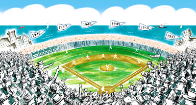
| 1 preliminary rough concept sketch of stadium scene |
 |
| 2 slightly more refined rough sketch |
 |
| 3 advanced sketch showing complete scene and general type positioning |
 |
| 4 final sketch on lightbox, and redrawing image onto watercolor paper |
 |
| 5 close-up of preceding image |
 |
| 6 final drawing of the fans in baseball stadium stands |
 |
| 7 close-up view of preceding image |
 |
| 8 completed drawing of fans, with touches of black added in |
 |
| 9 background painting of stands and stadium (crayon and gouache) |
 |
| 10 close-up view of preceding image |
 |
| 11 stadium background and drawing of fans layered into Photoshop |
 |
| 12 final art "stadium scene" (digital color completed) approx: 20" x 11" |
 |
| 13 close-up of preceding image |
The above sequence of 13 images shows the "stadium scene," from initial rough sketch, all the way through to the final completed art. What this sequence does not show is the intense layering in Photoshop during the stage where I add the digital color effects and combine all the various elements which comprise the full scene. Typically when I work in this method, there are usually about 15 to 20 different element and color layers within the Photoshop image file that are then all "flattened" to arrive at the final completed image -which is then delivered to the designer at the publisher. With this particular book project, I created all the final art at "same size" as the printed book size... so this "stadium scene" art is approximately about 20 inches wide x 11 inches tall. (With some book projects I work larger than the printed book size, and the art images are then reduced.) This step-by-step process described above was the same for the creation of all the inside illustrations and cover art created for the entire book.
 |
| 1 final art: opening spread of book: boys playing backyard ball in springtime |
 |
| 2 close-up view of preceding image |
The above two images are of the opening scene spread in the book... where it describes the kids of the neighborhood all running outside in the springtime to play baseball after school. It takes place in an ocean side town in New Jersey in the late 1920's. I particularly like how I created the houses throughout the book, which was by painting a rough, wide, swatch of blue and cream colored brush strokes, scanning it into Photoshop, and then digitally "cutting out" the needed shapes of all the various house "vignettes" for the different scenes throughout the book, and then adding the minimal architectural line details and windows on another layer to complete the look. The rough texture of the houses give the scenes an appropriate period feel and character.
 |
| 1 preliminary rough cover concept sketch |
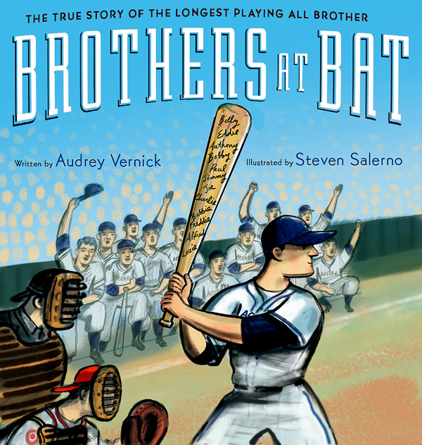
This sketch seen above was my initial rough cover concept. (With all my cover sketches, I dummy in the title and names, simply for me to see that I am generally allowing enough area for this text information to be generated by the designer. In other words, any type treatment you see in these early stage cover sketches are just generic... The book was superbly designed by Sharismar Rodriquez at Houghton Mifflin Harcourt.) My perspective is that a cover should always be bold, minimal, and only needs to visually suggest what is inside the book... in other words a cover does not need to spell out or reveal everything that the story is about in an obvious manner. Less is more, and also creates curiosity for someone to want to open the book.
I felt my challenge for this cover was to discover a way to create an image that was about 12 brothers on a baseball team without actually showing 12 brothers, so as to keep the cover image very simple and bold! No easy task. My above cover sketch concept was to show just ONE brother at bat, but the bat has all the brothers names etched into the bat. I felt this was a great resolve. However, this concept ended up not being the cover, unfortunately. I fought for this version, and still think it would have made the superior cover. (Though, had this sketch concept version actually been selected, in the final art I would have depicted the batter with a more determined and aggressive expression on his face.)
Below are other subsequent cover sketch concepts I provided, and well as the final cover art which was eventually arrived at.
 |
| 1 another cover concept sketch: the brothers wearing numbers 1 to 12 |
 |
| 2 another cover concept sketch: brothers looking directly back at viewer |
The above two sketches were amongst a variety of other cover sketch concepts I provided, which also were rejected. I particularly liked the bottom one... as it suggested the closeness and unity the brothers all had with each other. Their toughness kind of taunts the viewer... which I think also reflects the toughness of the time period the story is about.
 |
| 1 revised cover concept sketch |
 |
| 2 further revised cover concept sketch |
 |
| 3 final completed cover art |
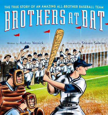
Above: two revised final cover sketches and the final cover art. I expressed the preference for my initial minimal cover sketch image of just the one batter only with all the brothers names etched into the bat, but apparently the marketing department wanted to see all the brothers on the cover... So, the final cover eventually became a compromised version which showed the batter (with the names etched onto the bat) but also included depicting all the other brothers in the background, plus seeing the catcher and umpire as well. (at that point I even added in the father "Pop" who was their coach) The resulting final cover art is quite attractive... but from my perspective, it is still not a particularly strong cover due to it being visually overly busy. As I stated earlier, I think a book cover is always more successful when it is minimal in its elements. Had I been able to go with the initial concept of just depicting the one batter only, I feel the cover would have been a simpler, more elegant and bolder cover. That being said, I think designer Sharismar Rodriguez created a very smart and tasteful resolve in dealing with such busy art by arcing the type design of the title to better unify all the elements. And her design of the title page is one of the best parts of the book! (I think my art for the cover is a solid stand-up double, rather than a home run...)
You will see Brothers At Bat in the bookstores early in 2012... and probably available sooner on-line.
Sometime soon I will be showing more of the final art from Brothers At Bat on my illustration web site. You can see samples of all my illustration portfolios, including my many other children's picture books on stevensalerno.com.


10 comments:
Lovely sketchings and awesome pictures.
What a treat! Thank you so much for sharing your art and your process here. I could not possibly be more excited about bringing this book into the world--with your art jumping off every page.
I adore the illustrations for this book and can't wait to buy it. So appreciate seeing your process and the evolution of the work.
Seeing sketches and the process of taking them to final art is always instructive and very interesting. The way you handled the crowd scene = brilliant.
I love the writing of Audrey Vernick (Resnick?) ;) and now I love your art, as well.
I never knew how a real illustrator worked--now I know what I've been missing! Very, very impressive, Steve--can't wait to see the printed results. All best luck with this.
Congratulation for such amazing project. I knew that you are genius, and you can draw so well, but this book is mind-blowing! You are very generous to share the step-by-step. I'm stealing for the project I'm working on right now. : ) I'm amazed how many detailed sketches you provided for the cover!!! Your clients are lucky!
As soon as it comes out, I want to buy a signed copy to send to my niece, the professional baseball player in Japan.
Thanks for Sharing your Observation
That's a Great point......thanks for Sharing..
Corporate Gifts Bangalore
That was fascinating and eye-opening to read about your process as well as the working relationship between all parties on this book. I can't wait to try the crayon/gouache combination and I look forward to reading this story. Thanks for sharing!
I featured Brothers At Bat this week on my blog post about baseball in picture books. http://bit.ly/KFvFB3
Your detailed process description above makes me love it even more.
Wow. Great article Thank you for the share!
Cargos For Men
Post a Comment