For the past 5 months I have been entrenched in my latest picture book project (Goldenlocks and the Three Pirates for publisher Farrar Straus & Giroux) and during this time I have very little extra time to also take on other peripheral illustration projects. So when I do, they are projects which are not tedious or too big, and I feel I can handle the time it will take to complete them....
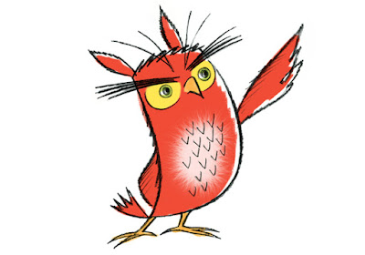
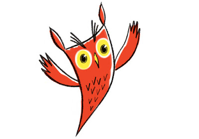
This post is about an assignment I recently took on from a design & branding firm here in NYC... whose client is in the clean energy field. The thrust of the project was for me to design an owl character who would appear on the client's new web site to act as an informational guide to their services. Once I designed the character the project was to also create five illustrations depicting the owl in various actions relative to five aspects of the client's provided service features. Here are the preliminary color sketches I presented...
 |
| sketch #01 crayon and digital color |
 |
| sketch #02 crayon and digital color |
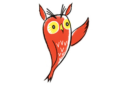
-at this stage it was decided that the owl would be RED color.... one of five colors to be strictly used within a limited palette chosen by the design firm as part of the visual architecture of the client's web site...
 |
| sketch #03 crayon and digital color |
 |
| sketch #04 crayon and digital color |
 |
| sketch #05 crayon and digital color |
The above sketches, 1 thru 5, are the initial character sketches I created.... #05 being the finalized version most like by the design firm at this stage. (This is all before anything is shown to the client)
 |
| sketch #06 crayon and digital color |
 |
| sketch #07 crayon and digital color |
 |
| sketch #08 crayon and digital color |
 |
| sketch #09 crayon and digital color |
The above sketches, 6 thru 9, are side versions created because the design firm now wanted to explore the concept of the owl looking more minimal and graphic, kind of like the google map locator icon...
 |
| sketch #10 crayon and digital color |
 |
| sketch #11 crayon and digital color |
 |
| sketch #12 crayon and digital color |
The above sketches, 10 and 11 are additional side versions created because the design firm then wanted to explore the concept of the owl looking more naturalistic yet still stylized... Sketch #12 was sort of a hybrid between the naturalistic representation and the earlier initial sketch #05...
 |
| sketch #13 crayon and digital color |
Above sketch #13 was created as the "final" sketch... because after seeing all the various versions the design firm felt that the final look should return back to looking more like the owl did in my initial sketches, using #03 as the reference to work off of....
So sketch #13 was the character version presented to the client as what they felt should be the look of the owl.
Long story short... the client rejected the entire look and thrust of the proposed newly designed web site presented by the design firm, and so the owl character as a concept was tossed out with the bath water...
Moral of the story for all you green-behind-the-ears young illustrators:
always make sure and have your client sign an assignment agreement contract with you before even starting the project. And make sure that the contract has a kill-fee clause in place defining exactly how much your fee will be in the case of the project being terminated after you have completed the sketch stage. Which, of course, I did.
Visit stevensalerno.com to view my various portfolio sections.