



To see all my illustration portfolio samples, visit stevensalerno.com
Usually, magazine and newspaper assignments have the quickest illustration deadlines due mostly to the simple fact that they need to ship the page designs out to the printers every week or every day. Advertising projects have more time, because the ad agency works in advance, and they require more rounds of sketch (comp) revisions and their client also take longer to approve final sketches and give the green light to proceed to final. Of course, my children's book projects have the longest deadlines...a couple months for sketches and a few months for completion of final art, but, all these various illustration assignment deadlines all overlap, so it seems I have deadlines all the time.
Last Thursday, late in the afternoon I received a call from Tammy Lucas, the art director at latitude (a division of The Richards Group) in Dallas, Texas. Her client, Harvest Partners, are the developers of a new retail/residential complex in downtown Dallas named Park Lane, opening next month.
Tammy had found her way to my work samples on the web, and felt I was a good style match for a series of advertisements they were designing for Park Lane... the first one being a depiction of the fountains that are a feature within the retail complex. The catch was that the final art would be due on Monday...
Most of Friday was spent back and forth negotiating and confirming the contract, signing forms, and receiving the art directors ad page "comp" (that had already been shown and approved by the client) which indicated the position of the ad copy, and that the image must be of of a bold, playful vertical spire of water from a fountain and use a specific green color, in my style. The ad image will be appearing in print ads (newspaper & magazines), direct mail, large format outdoor advertising, and web advertising.
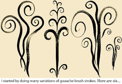
Thursday night and part of Friday, I spent time creating numerous black gouache brush paintings of various decorative squiggles, swirls and curls of suggested fountain sprays of water, and scanned them all at 600dpi CMYK into Photoshop. (because I needed to create a high-resolution file, due to the fact that the design firm would also be formatting large size versions of this ad)
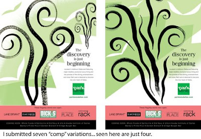
Friday night and half of Saturday I then created (in Photoshop at low-resolution 100dpi) about seven various comp versions of the ad image, dropped into the ad page template, and sent them off to Tammy in Dallas. These initial early comps used the different "brush strokes" I had created, all with added different simple background shapes. My intention was to keep the image simple, light, elegant, and with a playful feeling. And simple was the only graphic approach to take considering that final art was due on Monday!
Tammy then focused in on two of the initial comps, and I then developed those particular images further... but eventually just one approach was selected and even that one went through various mutations. The plan was to have the client review the "final comp" first thing Monday morning, approve it quickly, then allowing me most of Monday to complete the actual high-resolution final image. But the client ended up liking one of the earlier comps... so I went down that avenue on Monday, but that image was eventually rejected for the "final comp" Tammy and I had originally presented.
Now the deadline for final art was shifted from Monday to Wednesday morning! Part of Tuesday was spent fine tuning the final comps several times. Because this image was graphically very simple, the comps were allowing the AD and client to essentially see almost exactly what the final art would look like. A more graphically complex final image cannot have equally detailed sketches or comps. By late afternoon the "final(revised4x)comp" was finally approved, and I then spent until about midnight completing the final art and uploading it to latitude's ftp site. Whew! I was a hermit for five straight days, but it was a job that ended well, and the client was happy with the result.
Initially, my goal was for the image to be simple, elegant and a bit funky. The image ended up being much more funky, but it works. Viewers will love it's fun and energy... and a few may even hate it, but the image is definitely striking and will certainly stand out in the crowd. I applaud the client for going forward with this stylish approach, when they could have just as easily gone with a conservative one. I look forward to others in the series and working with Tammy Lucas again.

