 |
| visit stevensalerno.com to see more maps! |
Posted here are just a few of my favorites. Above is a minimal-color map of Italy I did for a travel magazine assignment. It was created with gouache and a few splashes of watercolor and pastel.
 |
| visit stevensalerno.com to see more maps! |
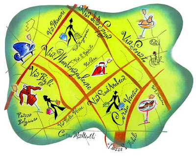
Keeping with the Italy theme, the map above depicts a shopping district in Milano. The map was one of several illustrations in a series for an advertorial for the Italian airline Alitalia. It was created with ink, pastel, crayon, and compiled in layers in Photoshop. The next sample of one of my map illustrations (below) is one I did for CRAIN'S Business NY, and depicts the Williamsburg area of Brooklyn, NYC. I created this one with textures painted in gouache, scanned into Photoshop, and then I "cut-out" the shapes I needed digitally, additionally adding in my little paintings of boats, waves, the bridge, a bus, etc... as well as my hand-lettering.
 |
| visit stevensalerno.com to see more maps! |
The last map illustration sample is of a small upscale shopping area in Paris wedged between the Rue de la Roquette and the Rue de Charonne, with the charming "O Petit Bar" just around the corner. My favorite touch is the silhouette I made of the boy and dog in the foreground. This is an older illustration of mine, created well before I even began adding vector and other digital effect images to my ways of creating graphics. This map was created just with ink, pastel and watercolor, with the lettering done directly within the art image too. If I were to create this type image again today, I would definitely make it by scanning the various drawn and painted elements into Photoshop and then designing it in separate layers, which would all be SO much easier and a far more flexible way than the "traditional" way it was originally created!
 |
| visit stevensalerno.com to see more maps! |
Visit my illustration web site, stevensalerno.com to see more samples of maps! As well as packaging, children's books, advertising, etc...
And I look forward to hearing from the next art director who calls and asks, "Do you do maps?"


No comments:
Post a Comment